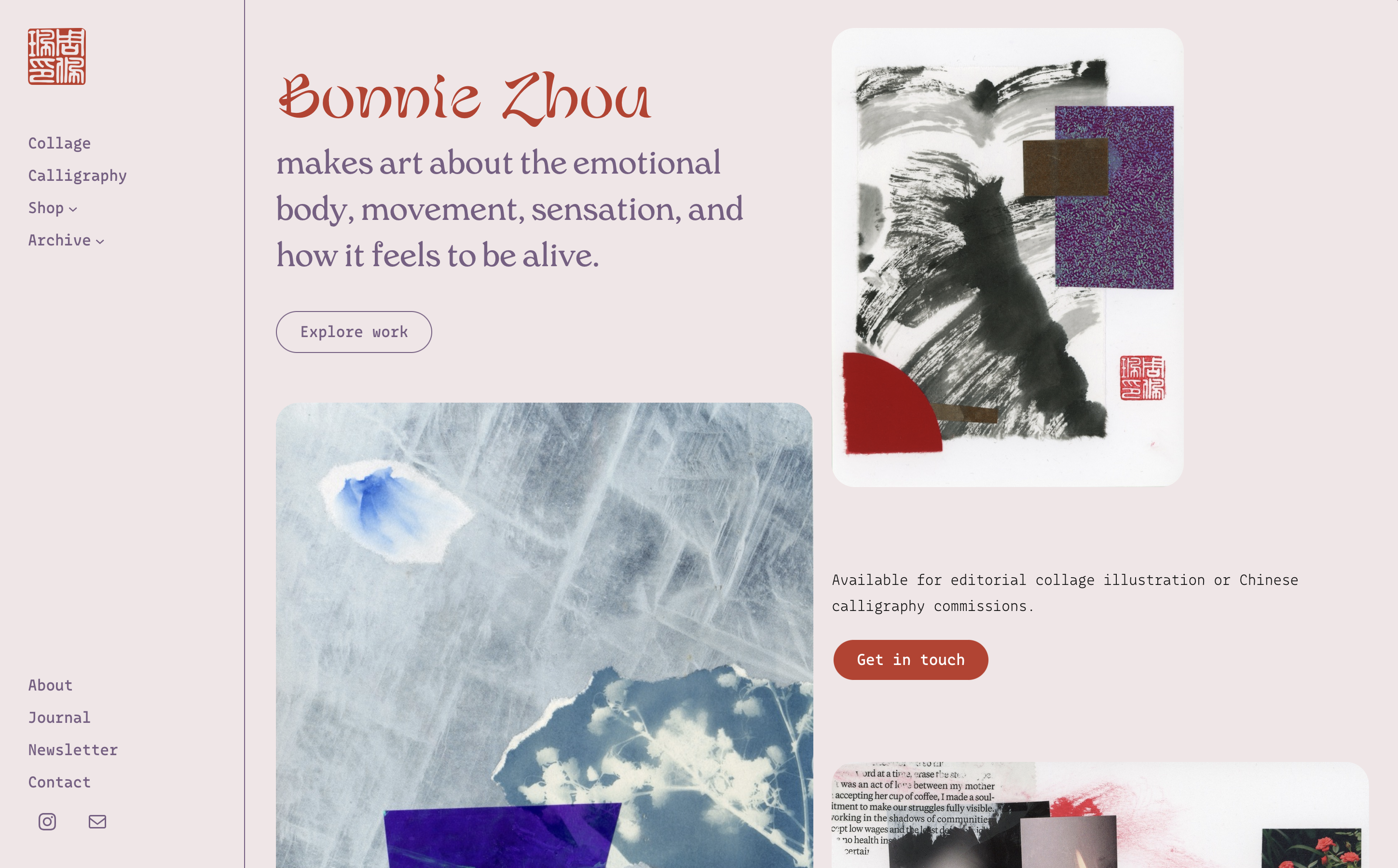
Bonnie Zhou
Design Systems · Typography · Visual Identity
A designer and engineer with 6+ years of experience building interfaces and design systems at Google scale, a postgraduate certificate in type design, and a practice that merges visual expression and systems thinking.
01 Design System
Building the shared visual language of Google.
From 2017–2020 I was one of the core design engineers on Material Design at Google, the design system underlying the company's entire product surface. My work touched visual implementation, component API design, developer documentation, cross-team adoption, and the education programs that helped thousands of designers and engineers implement the system correctly.
50k
weekly active users
Material
Components
for Web
2k+
tutorial
completions
in 2020
30+
workshop participants
per session
4
countries for
conferences &
outreach
Material Components for Web · Text Field Variants
Component API design
Designed the developer APIs for components in Material Components for Web and React — balancing flexibility with constraint, prioritizing developer experience, CSS/JS performance, and pixel-perfect implementation of the visual spec.
Design-to-engineering workflow
Maintained engineering documentation, ensuring components stayed in sync with Figma libraries. Served as cross-org liaison between engineers, designers, PMs, and Developer Relations — speaking the languages of design critiques, code reviews, product strategy, and community feedback.
Component catalog
Built the Material Design component catalog website in React, acting as a shared source of truth where designers and engineers could see components in context with up-to-date live demos and documentation.
Legacy codebase navigation
Worked across a large multi-team codebase to drive consolidation, deprecate old patterns, and migrate implementations.
Component catalog
02 Type Design
Type design is the most exacting form of visual decision-making.
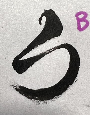
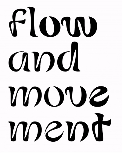
Fluidence is a display typeface that captures the expressive flow of Chinese brush calligraphy in Latin letters. With its dynamic modulation, bold contrast, and abrupt directional shifts, it evokes the energy of an ink brush moving vividly to the whimsical temperament of its holder. A playful and modern typeface, Fluidence nods to the rich, timeless beauty of Chinese and East Asian culture. Fluidence is best suited for headlines, branding, posters, or any project that needs a touch of movement and charm.
Design origin
Fluidence is an original variable typeface designed during my Type West postgraduate program at Letterform Archive. It has a variable weight axis to ensure its lush curves — the defining feature of the font — flow smoothly at all weights. It was designed from initial hand-drawn sketches through final export and specimens composed in Figma.
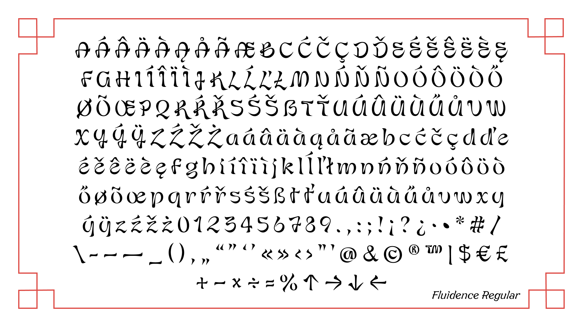
Fluidence Regular · 2024–2025
Sketches → interpolation → specimen
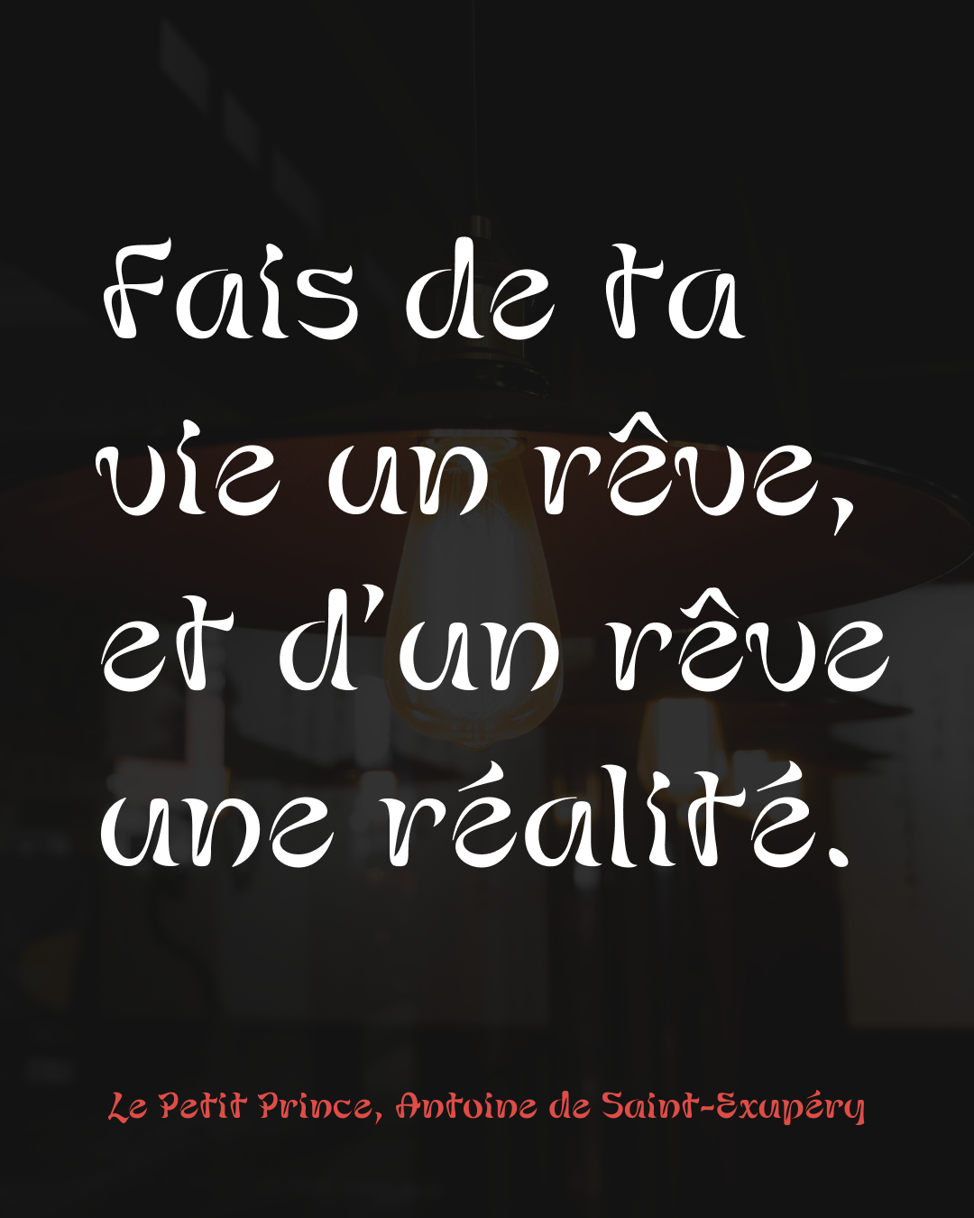
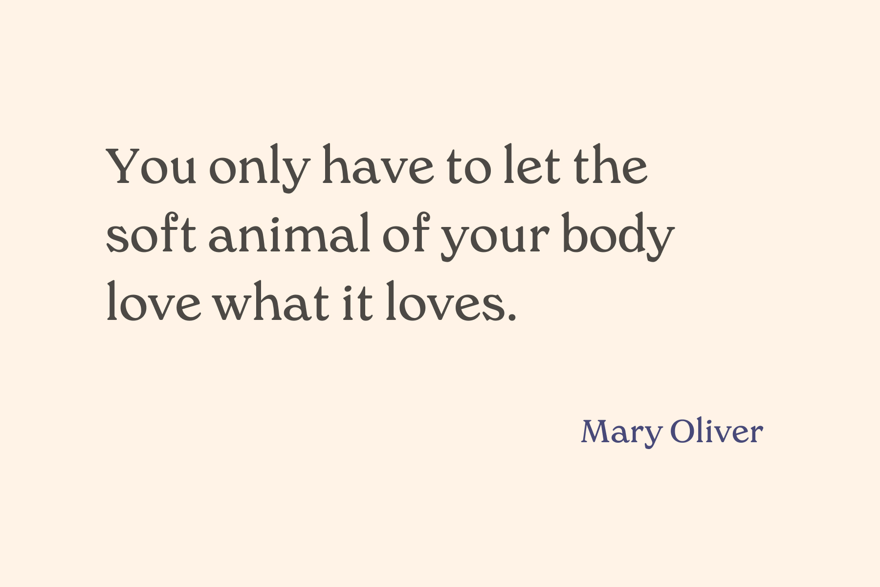
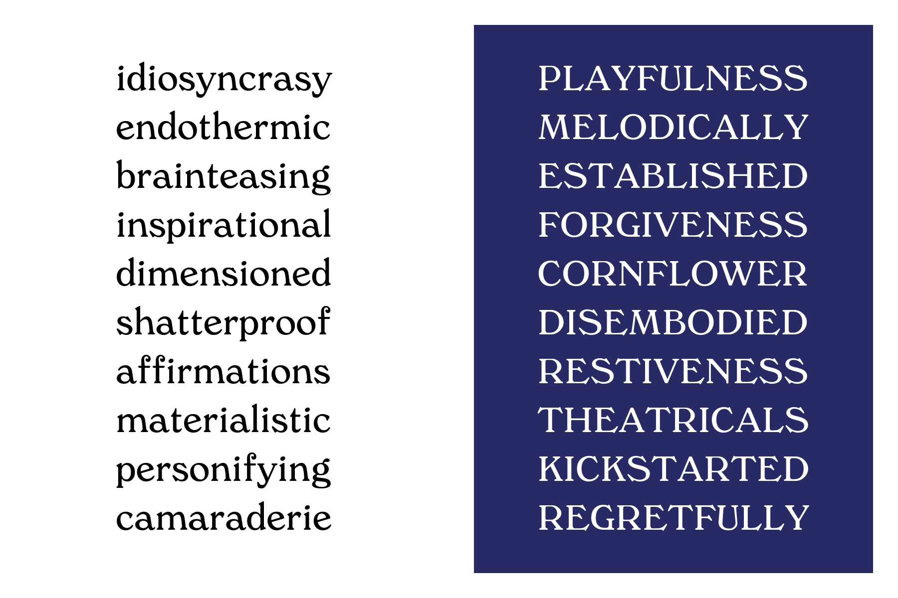
A revival of a 1908 typeface, evoking the casual yet elegant feeling of un-sophisticated glamour. Jasmine de Lune was designed prior to Fluidence during Type West. It is a type revival of St. George, a typeface published by Stephenson Blake & Co designed as "a high-class letter for commercial work, booklets, catalogues, books and more".
Jasmine de Lune · 2024
03 Web Design
Every design decision, implemented by hand.
bonniezhou.com is designed and built in WordPress by me — from branding and voice to information architecture, responsive behavior, and accessibility. It combines a collaged, mixed media sensibility, as seen in the asymmetrical grids for pages like Home and About, with a retro, file-system-like framework, a nod to my systems thinking and love for analog processes. Serving as the hub for my art practice, writing, and online shop, it allows me to experiment with new design patterns, push technical boundaries, and express my visual sensibility in a way that client work doesn't always allow.
bonniezhou.com — designed, built, and maintained by Bonnie Zhou
Information architecture
The navigation encodes a hierarchy of intent: commissionable work (Collage, Calligraphy) at the top; commercial work in Shop; and everything else (Photography, Painting, past practices) in Archive, framed not as abandoned pursuits but as a living source material for the work I make now. A secondary menu holds the quieter pages (About, Journal, Contact). Every section knows what it's for, and so does the visitor.
Design variables as tokens
Type, color, spacing, buttons, margins are all variables, all defined once. Dimensions on a 4px grid throughout. Visual consistency is the result of treating every repeated decision as a system rather than a one-off.
Responsive & accessible
Typography scale, spacing, and layout respond across breakpoints with careful attention to contrast ratios, semantic HTML, and keyboard navigation.
Mobile homepage · About page
Website footer
Technical stack
04 Visual Sensibility
The aesthetic conviction behind the systems work.
My art practice is the source of visual discernment in my design work. Collage, calligraphy, photography, and painting have trained me to see composition, color, and texture with a sensitivity to nuance. I understand the weight of a mark, the charge of negative space, the dance between tension and exhale. That sensibility is what I bring to layout, hierarchy, and every design decision.
Collage · Drawing · Photography
Thank you
I'm looking for roles at the intersection of creative vision, design systems, and technical education — teams that care about craft at every scale, and the humans on both sides of the work.